1) The rectangular packaging is the original packaging whereas the cylinder shape packaging is my friend's group design. They have modified the packaging into a smaller size so as to make it easier to take and can save more space to put it as well.
2) The new packaging have given the more informations to the people as the more pictures show that the results of taking the sweets when they get throat ache but it is not be shown on the original packaging. It is very important to let the people clearly know about the functions of one thing so that they will not misuse it.
3) This is my group's packaging design. The red colour is dominant in the original packaging and it is not so attractive to the other people. So, we have changed it to the more colourful packaging. Even though our packaging is not as fine as the original packaging, but we use more colours so that it can be more attractive.
4) Since this is the hand made packaging, we just use the cellophane tape to stick on the back side of the packaging. The benefit of this packaging is that the handle is added at the top in order to make it easily to hold.
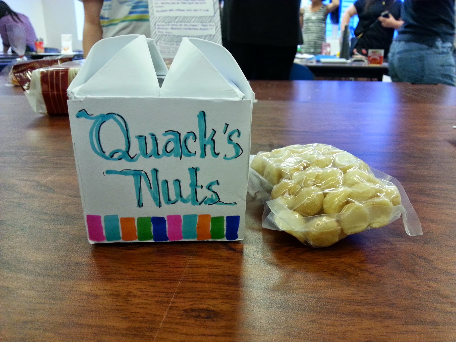
5) The new packaging design for '' Duck's Nuts '' by other groups. They have changed its name to '' Quack's Nuts ''. This is a good try as there is a difference with the original packaging design.
6) This is the different sides of the '' Quack's Nuts '' packaging. The top is more special as the shape seems the flower. In additional, a duck is drawn beside the packaging so that the people still can know that it is '' Duck's Nuts '' even though its names is changed to '' Quack's Nuts '' already.
7) Bluebird brand potato chips but there is not any bluebird except the penguin! It is so weird as the '' bluebird '' is holding the potato chip and running! This is what we see at the original packaging. Finally, the packaging is modified in a new way as the '' bluebird '' is covered almost the packaging and it is not holding the potato chip and running. In other words, it looks more normal.
8) The new packaging is made into the cylinder shape with the handle on the top so it is quite convenient to take it. Furthermore, there has a zip at the packaging body so that the people can easily take out the potato chips.
9) The new design packaging is a bit bigger than the original packaging. But I preferred the original packaging as the yellow colour on the original packaging shows that these are the potato and the potato stick. In other words, the colours are very important in every design even it is just a simple design.
10) Yik Kuen is one of my group members is explaining about her impression to the packaging design by our group in front of the classroom. By this, I get the reflection that the packaging design is very important nowadays and it is a must to put a lot of effort on the design. As an art student, we have to enhance our knowledges about art and design in order to help ourselves on our design work. By other saying, no house is built in one days we need to learn how to design on thing step by step but not by the short cut way.


No comments:
Post a Comment