1) This is the sunflower watch which is very bright in colour. For me, it is special since I seldom even never see the watch with the sunflower design. The watchband is designed with some smiling and funny faces. Furthermore, there is a high heel shoe holding both of the hour and minute hands.
2) This is the watch that without so much colours and designs. However, it still looks cute as the watch is designed like the cat head with two ears on the top. The light blue colour is used to design the pattern on the watchband.
3) '' Chocolates For Life Approved '' watch seems to tell people that chocolates are one of the must food to carry on our life. The brown colour is dominant in the design which it is mostly used and adapted on the watchband with a lot of rectangle patterns. Beside the rectangle patterns, there has some circles at both sides of the watch so that there have different kinds of patterns on the watch.
4) The blue, red, orange and yellow colours are used for designing the watch. For me, it is simple but colourful watch so it can attracts people's attention. The dark blue colour is used to form many semicircles on the watchband.
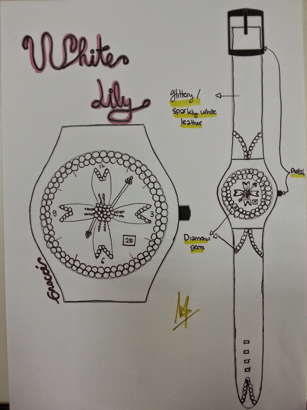
5) The theme for the watch design is '' White Lily ''. Obviously, the watch is totally designed by using white colour according to the theme. There are many circle patterns surround the watch and used to embellish the watchband as well. Sometimes, it is not necessary to design the watch in colourful way. The simple with single colour watch will do.
6) This watch is just only designed by the thick and thin lines that cross to each other.
7) The watch is designed with the beach motif. The coconut trees are drawn on the watchband. The light blue colour is adapted at most of the watch part and this colour is same with the sea water colour. More ever, the centre of the watch is designed with the scene of the beach.
8) The design of the watch is quite terrible. At the centre of the watch , the dragon eye with the dark green colour has increased the horrible feeling of the people towards the watch.
9) When I saw the design of this watch, my impression for it is that this is a really creative design.
10)This watch is designed by me. The watch is about a ballet dancer is performing the dance. The red colour is used to indicate the passionate of the ballet dancer towards the dance. In additional, the red colour watch is more suitable for girls to wear, especially for those who have the beautiful white skin so that the red colour watch will be more contrast when it is worn on the hand with white skin.


No comments:
Post a Comment