Tuesday, 10 February 2015

Different sources


Classrooms are Boring


Books
  • “Classroom of Choice” by Jonathan C. Erwin. Chapter 4. Power in the Classroom Creating the Environment. May 2004.
  • “Mirror” by Jeanie Baker. Walker Books. August 2010.
Periodicals (Journals/Magazines) 
  • dezeen “Roc Apeldoorn Classroom” By Jurgen Bey 30 September 2007. Marcus Fairs.
  • “Lectures Aren’t Just Bring, They’re Ineffective, Too, Study Finds” By Aleszu Bajak.
    SCIENCEINSIDER. 12 May 2014.

Electronic Sources
  • “Boredom in the Clasroom: Why are So Many Students Bored – and What Can Be Done?” Educhatter”s Blog. Educhatter.wordpress.com
  • “Classroom Environment” By Angela miller – Kathryn Cunningham . April 18, 2011 http://www.education.com/reference/article/classroom-environment/ 


Classroom of Choice
It is a fantastic book , packed with rich and highly practical contents, including some advices and activities. I have found some contents which are useful such as 'Laying the Foundation for a Classroom of Choice' , ' Survival in the Classroom ' , ' Love and Belonging in the Classroom ' , ' Creating the Environment ' , ' Freedom in the Classroom ' and ' Fun in the Classroom '. All these are about what the students needs and what we can do to fulfil their needs in order to help them in their study and school life . 

Mirror
Experience of : reflecting on text , sharing reading & viewing , reading & writing , speaking & listening , 
                             creating and research .
Values addressed :  Intercultural understanding ,  Care & Compassion and Respect . 
Themes :  Places , Belonging , Identity , Environment , Understanding Each Other and Tradition and
                   Heritage . 

Roc Apeldoorn Classroom
Jurgen Bey has completed a classroom interior project at the Roc professional training school at Apeldoorn in the Netherlands.The classroom walls, floor and furniture are decorated with images taken from reference books used at the school.Everything in the classroom is coloured either white or grey. Spaces are divided by moveable hanging screens (below) that are also printed with technical patterns.

What I can say about this is that it's really amazing ! I never thought of graphic design in interiors can be this detailed and worked . It is unimaginable to see Bey gives careful and complete attention to just everything inside the room . 

Classroom Environment
The contents include ' The Physical Environment ' , ' Classroom Climate ' , ' The Psychological Environment ' , ' Measuring Classroom Environment ' and ' Implications and Considerations ' .  From the source , I know about that a classroom can be set up in a way that stifles creativity or does not promote a positive learning environment. There are many things that can affect this environment. There are physical elements such as wall art, arrangement of desks, or resources. Also, there are intangible elements such as the energy of the classroom, the rules, or the sounds within the room. Each of these can impact a student’s focus and achievement in the class. They can also affect a teacher’s attitude in the class. Included in each of these elements of the classroom is the emotional environment.


Wednesday, 4 February 2015

Empathizing

 https://www.youtube.com/watch?v=E15sYx-cpso&index=2&list=PLD57742DD81BF1CE0


        Empathy is quite ordinary and important in our life. We may have this feeling when we face certain condition. Empathy is totally different with the sympathy as with empathy we can feel the connection whereas with sympathy we will dry the connection.

        For this year 1 semester 2 with the module Design Process, our group have chosen the title '' Classrooms are Boring'' to look into and deal with the problems. First of all, what we need to do after choosing this title is not immediately think about the solutions for the problem but we need to have empathy with the problem.

       At my study place, what I see is that the classrooms are really let the students to feel boring due to some reasons. For instance, the environment of the classrooms most of the times are untidy as there have some rubbish around the classrooms. Also, the lack of facilities affects the study mood of the students in the classrooms. Even nowadays is a era that advance technology is very much needed for every area but sometimes students do not have the opportunity to have and enjoy it. As a result, they may can not do well and be outstanding in their studies. In other words, this is the outcome because of the lack of advance technology. Besides that, the old furniture cause them to feel inconvenient when using. However, the school never change the new one for them. Furthermore, I also find that students are not satisfied with the classrooms design too. This problem is caused by the too common design in the classrooms. Most of the times the classrooms are not much design or even the old school design. That is why the design in the classrooms is not really interesting to most of the students. What they want is the ''interesting place''.

        In conclusion, classrooms are boring is the problem that the students face now. I myself also deeply feel that because I am a student student too and I can feel what they feel. In other word, I have the empathy with them. With empathy, I can make sense or more understanding what is happening in our surrounding. It brings ourselves to the solutions as we can feel the truth.  Last but not least, to make is to realise empathy. It is at the heart of the bottom of what it means to be. It is a human right.    

Friday, 10 October 2014

I love high heel shoes !


Possible? It's possible!

1) The spaghetti are poked at the centre of the sausage and this makes the new dishes. We can eat the spaghetti and the sausage at the same time. So, it is very convenient to us.

2) The unwanted can or bottle cover can be used to make the small pot for the plant and put on the table. The pegs are used to clip around the can or bottle cover in order to decorate it so that it will look nicer.

3) It is the useful template as we can hang our handphone in the middle of the air once we charge our handphone. This can prevent our handphone from getting dirty if we place the handphone on the floor.

4) It is not necessary to buy the big cupboard  that be placed on the floor to put the books. The books that have arranged and put in this way can save the place and it looks tidier at the same time.

5) The extra or unwanted tennis ball can be used as the ''things holder''. Cut a little bit of the tennis ball at the centre will do. It can be done more since it is very cheap and it can be easily found at the shop.

6) The different colours of socks with some designs can be used to cover the cup for making the vase. So, we need not to waste the money to buy the new and expensive vase since we can do it by ourselves and we can make whatever kinds of vase that we want.

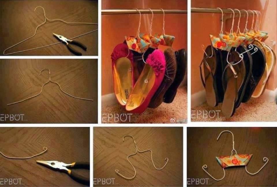
7) The old and broken hangers is quite useful as they can be reused to shoes.

8) The unwanted tyre can be reused too to make a nice chair. I thick ropes are needed to paste around the tyre.

9) The glass bottles are painted in different colours and the light bulbs are put inside the glass bottles in order to make the chandelier and the stand for the lamp on the table as well. In other words, the glass bottles are quite useful as they can be used in many ways to perform the creative and amazing art work.

10) When the four sofas put together horizontally, it is a adornment but when they are separated and arranged nicely, the set of furniture is shown.

11) A table with four stands and the four sofas can be arranged together and they will become the round table without any stand under it.

12) The purpose of designing the table and chairs in this way is to save the place so that there will be a larger space for the people to walk around.


Fashion style


1) The design of the skirt is quite unique that the lips with dark red colour is printed on it. Furthermore, there is a gold colours belt and this colour is very match with the black colour shirt and white colour skirt with dark red lips.

2) The shirt is simple and there is no much design on the shirt whereas for the skirt, the movement of thick black lines are showed.

3) The dress without sleeves is designed with different kinds of patterns with different dark colours such as dark chocolates, dark blue, dark green and others. The dress is suitable to wear on the hot day and for attending the wedding dinner as well.

4) This is the shirt that without sleeves. There are many small squares with red and white colours on the shirt. In additional, the buttons are stitched horizontally at the centre of the shirt and the purpose is that just to decorate the shirt in order to make it nicer and more attractive. Besides that, there is the white lace at the top.

5) The dress is very suitable for the girls who have the fit body to wear since it is the close-fitting dress. More ever, the colours of light yellow and black are very match with each other.

6) The black dress without so much design and this is the reason that I very like to wear it to attend the wedding dinner. Sometimes, fashion does not mean that the design on the skirt, dress and shirt must be attractive and colourful. If you have no idea what should you wear on that day, the simple design shirt or dress will do.

7) The coat is different with the formal coat which is totally black in colour. The coat is designed by both the semi circles and round circles with black and white colours.

8) Three red roses are printed at the centre of the shirt and there is a love shape with colour surround the roses.

9) This is the typography style design of shirt. There is only two colours on the shirt which are black and white colours.

10) The picture of Coca Cola bottle is printed on the dress. It looks emphasis on the dress since the bottle is surrounded by the very big red circle at the centre of the dress.


Thursday, 9 October 2014

Colours

1) The drawing is done during the previous 2D Fundamental lesson by using dots with different colours like dark red, dark orange, light pink, and dark grey. The chosen colours should match with each other so that the drawing will look better, nicer and more attractive.

2) Same types of cats can be shown by different colours such as blue, light purple and light yellow as well when we o the art work. This is the power of colours.

3) The bikini is designed by adapting the peacock's feathers pattern on it. Since the peacock's feathers have multiply of colours so it is suitable used as the ideas for designing the colourful bikini.

4) Another design of bikini which is more lighter in colours. The colours used in the design are light blue, light pink and white.

5) Romantic scene is shown in the place by using plenty of the dark blue colours lights.

6) This is my art work during the previous Drawing Fundamental lesson. Obviously, both of the hand movements are performed by different colours which are gold and red colours. For the hand movement on the top, I use my fingerprint painted with the gold colour to design it whereas for the hand movement under it, it looks bloody as I purposely do it in this way by using the straw to blow the red water colours spreading out in the space of the hand.

7) The dog cookies with different colours are sold at the pet shop located at the Vivo City. Each of the colours represents the flavour of each cookie. In additional, the cookie are also made in different alphabet shapes to let the people more easier to know the flavours of the cookies besides seeing the colours of them.

8) The displayed ice-creams are in various type sod colours such as red, yellow, green, purple, white and chocolate as well. Even though they are the fake ice-creams but they are really not so much different with the real ice-creams. The more colours of ice-creams displayed , the more attentions by the passer-by towards them.

9) It is not surprising when we see the red apple s and green apples with white fleshes but now the red apples with red fleshes have existed in China. For me, it is extraordinary. The colour is important to tell us what the object is and sometimes we maybe get shocked of what we see is different with what we normally think it is.

10) Vitagen si one of my favourite drinks since I was young. The different colours of vitagen represent different flavours for each bootle of the vitagen.

watch design

1) This is the sunflower watch which is very bright in colour. For me, it is special since I seldom even never see the watch with the sunflower design.  The watchband is designed with some smiling and funny faces. Furthermore, there is a high heel shoe holding both of the hour and minute hands.

2) This is the watch that without so much colours and designs. However, it still looks cute as the watch is designed like the cat head with two ears on the top. The light blue colour is used to design the pattern on the watchband.

3) '' Chocolates For Life Approved '' watch seems to tell people that chocolates are one of  the must food to carry on our life. The brown colour is dominant in the design which it is mostly used and adapted on the watchband with a lot of rectangle patterns. Beside the rectangle patterns, there has some circles at both sides of the watch so that there have different kinds of patterns on the watch.


4) The blue, red, orange and yellow colours are used for designing the watch. For me, it is simple but colourful watch so it can attracts people's attention. The dark blue colour  is used to form many semicircles on the watchband.

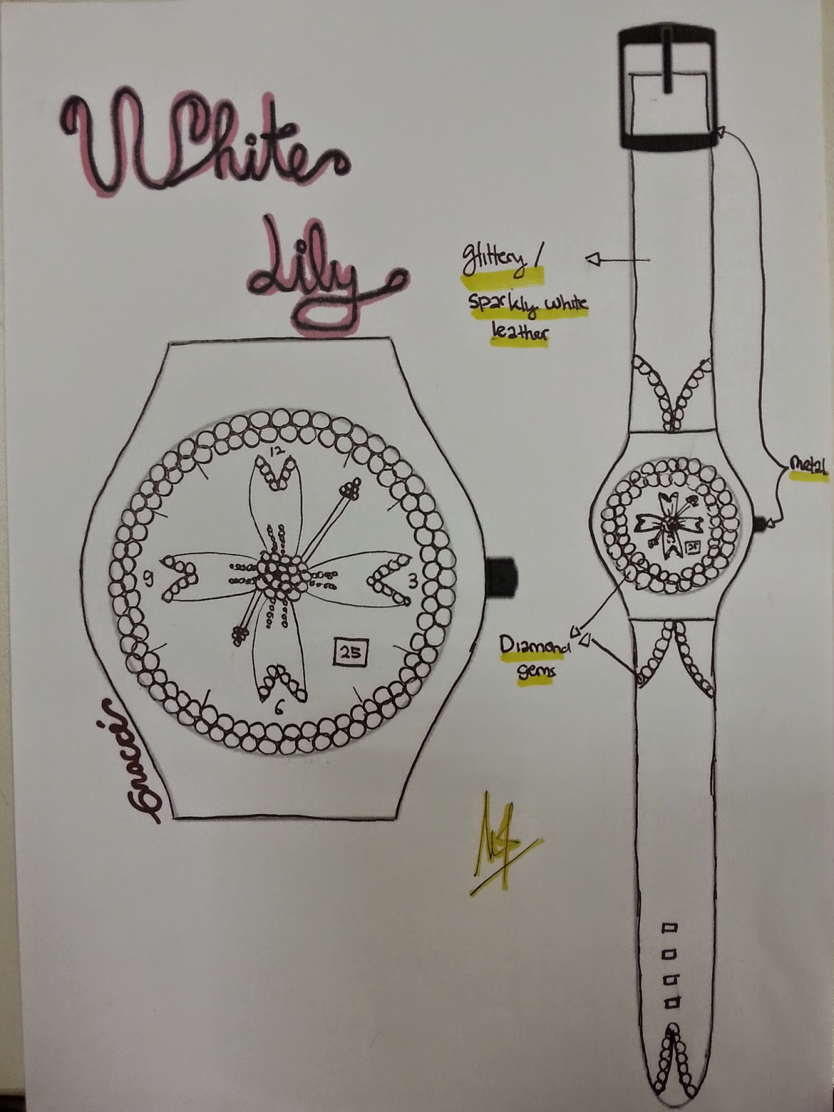
5) The theme for the watch design is '' White Lily ''. Obviously, the watch is totally designed by using white colour according to the theme. There are many circle patterns surround the watch and used to embellish the watchband as well. Sometimes, it is not necessary to design the watch in colourful way. The simple with single colour watch will do.

6) This watch is just only designed by the thick and thin lines that cross to each other.

7) The watch is designed with the beach motif. The coconut trees are drawn on the watchband. The light blue colour is adapted at most of the watch part and this colour is same with the sea water colour. More ever, the centre of the watch is designed with the scene of the beach.

8) The design of the watch is quite terrible. At the centre of the watch , the dragon eye with the dark green colour has increased the horrible feeling of the people towards the watch.

9) When I saw the design of this watch, my impression for it is that this is a really creative design.

10)This watch is designed by me. The watch is about a ballet dancer is performing the dance. The red colour is used to indicate the passionate of the ballet dancer towards the dance. In additional, the red colour watch is more suitable for girls to wear, especially for those who have the beautiful white skin so that the red colour watch will be more contrast when it is worn on the hand with white skin.